Visualizing Spatial Data

Generating Rainfall Surfaces with Interpolation Methods

The main focus of these layouts is to understand and display data that does not exist, using known data points. We are simply filling in the blanks, so to speak, to gain an understanding of spatial phenomenon.  In this case, it is rainfall data for March of 1982.

The process of displaying data involves looking at the data itself. We had to understand why the data looked the way it did when it was interpolated, instead of just making the map look nice. Since most data we see on the news looks a certain way; clean lines, smoothed out, it may be that it is over simplified, and gives the viewer a false interpretation. It is imperative that data be given a method ad-hoc, removing the idea that generalization is always better, just because it looks nice.

The figure below shows the spread of the rainfall data, spanning across three UTM Zones in Ontario.

Figure 1 - Spread of Data
The next step towards creating the interpolation is to look into the data; where are the outliers? Why are the outliers there? Figure two below shows the results of these findings, generated using ArcMap.
Figure 2 - Comparing Data
After this was done, the data could be interpolated. What this means is that we could start filling in the blanks between the data, to produce a sort of visual gradient to show where precipitation was likely to fall. This is done by solving unknown points with known points. Many methods of interpolation are available, and each has its own benefits. The methods chosen for this application were Ordinary Kriging, and Inverse Distance Weighting (IDW). Figure 3 below shows the result of this process.
Figure 3 - Kriging Interpolation Surface
Figure 4 below shows the alternate method of interpolation used, and one may notice the visual differences.
Figure 4 - IDW Interpolation Surface
These differences don't lend themselves to be wrong; each surface is correct, it is just a matter of what the user, and the viewer want to see. For instance, scientifically accurate surfaces might be used by Environment Canada, and look like the surfaces above, or surfaces could be used for display in a town hall meeting, and be more generalized to give the public an idea of trends.

Each surface was chosen using very precise research and settings, and if you would like more information on the data please feel free to contact me at my email address, located in the Contact section of this site.

Surveying with GPS, Total Station and Auto Level

Total Station and GPS Surveying

Along with my main thesis project, several surveying sessions took place throughout the year. These surveying sessions were conducted as if they were for a client, so data integrity and professionalism were graded highly. Field notes were taken as data was collected.


GPS Survey

Our first task was to use a handheld GPS Unit, a Trimble GeoExplorer 2005 Series GeoXH, to conduct a GPS survey of an area on campus. These areas were surveyed by groups, and had to be set up so that they would be easily merged with other group data. For example, parking lot lines had to follow a same-name convention, so that final processing would be seamless across multiple group survey zones.


Figure 1 - GPS Survey with topological errors, to be corrected

Once the data was imported, it was corrected topologically, so that polygons were seamless across multiple group boundaries. The result can be seen in the final output map below.


Figure 2 - GPS Survey with seamless topology


Total Station Survey

The second session of surveying incorporated the use of a Total Station. This Total Station Survey employed the use of the Nikon Total Station DTM-302 Series. Again, like the GPS Survey, groups were given boundaries to collect data points in, and professionalism was highly graded. Field notes were meticulously taken.


Figure 3 - Digital Elevation Model generated from surveyed points
Figure 4 - Model without visible surveyed points

Figure 5 - Digitized land features for Class boundary


Auto Level Survey

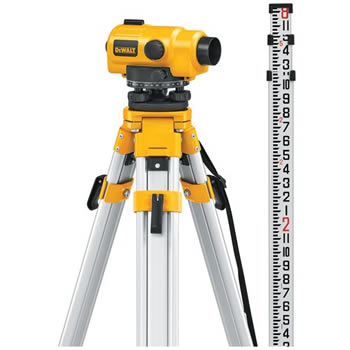
A final surveying session employed the use of an Auto Level. However, this did not require the creation of a map layout.


Project: Chemical Effect on Water from Wine Making Facilities

Chemical Spreading Effect on Streams

This project shows a visual interpretation of how different wines (Red, White, Rose) have an effect on the streams located near the wineries. This data is fictitious, however it serves to show what types of analyses on data can be used with simple winery data tables.


Visualizing Geospatial Data

Visualizing Geospatial Data in Real World Application

These layouts feature a part of the Niagara Escarpment, where an analysis is being done to determine slope and aspect of a highway ramp, viewshed analysis of an escarpment vista, and the profile of the escarpment itself.


Remote Sensing and Image Processing

Remote Sensing and Image Processing

These layouts feature processes for processing aerial imagery such as orthorectification, photogrammetry, and generally analyzing imagery through GIS.

Figure 1 - Finding Problem Areas when Orthorectifying

Figure 2 - Using ERDAS Imagine to perform supervised and unsupervised classifications to reveal land use patterns


Short Hills Park Project Draft Layout


I have been working with the Short Hills board members and Ministry of Natural Resources to collect trail GPS data, and produce this map based on the collected GPS data.

This layout is a draft copy of the final trail map to be used by the Short Hills Provincial Park. To read further about the creation of this map, please navigate to the Current Projects page of this blog.

Please see my Current Projects for more information.

Google Sketchup Modelling to Display in Google Earth

Generating Models in Sketchup to export to Google Earth

In this project, images were taken of our campus buildings to be applied to a model created in Google Sketchup. These models were made from scratch, by using a combination of aerial images, ground control points, and known heights for building roofs. To goal of this project was to create a true-to-scale and realistic model of the campus buildings.

Shown below is screen captures of the models, please click on the images for a larger view.

Figure 1 - Main Campus View 1

Figure 2 - Main Campus View 2

Figure 3 - Campus Residence Building View 1

Figure 4 - Campus Residence Building View 2

Landfill Analysis - Calculating Remaining Space

Finding Volume Between Two Surfaces

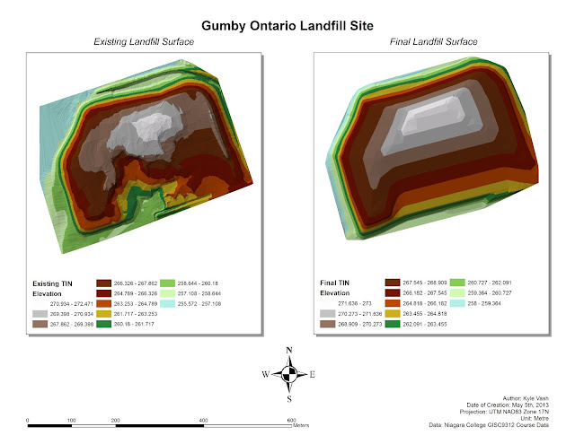
For this project a technical memo was produced (please send me an email and I will forward the document). The project involved calculating space between an existing surface (Landfill) and another surface (Contours from the Ministry of Environment). The landfill surface must be constrained to the final surface the MOE set forth, or else fines and penalties would be applied to the landfill.

With the use of GPS Survey points provided already, a surface map could then be made of the existing landfill, and the MOE Final Contours.


Figure 1 - Existing Landfill Surface (Left) and Final Landfill Surface (Right)

From these surfaces, we are able to calculate the places where the existing landfill surface "breaks" through the MOE Final, and also where there is space beneath the MOE Final for more garbage yet to be filled. The Cut/Fill tool inside ArcMap allows the analysis of these points, shown below. The areas in red are overshooting the MOE Final surface, while the blue areas can be filled in.


Figure 2 - Blue Areas denote places to be filled, Red areas must be cut down

So with this analysis comes a map that can be used by the landfill to show exactly where they must plow garbage to avoid fines by the Ministry of Environment. As well, exact volumes can be derived from the spaces between the existing and final surface. The table below shows the Cut/Fill results, with blue highlighting being the shapes (areas) below the MOE Final surface, and areas shaded red being above. 

The bottom line is that there is 123,812 cubic meters left to fill in, meaning that the garbage can be moved around to fill in voids and escape any fines and fees for overfilling.


Cut/Fill Results
ObjectID
Count
Volume (m3)
Area (m2)
1
83806
-133104.7656
83806
2
4791
4026.317871
4791
3
2240
375.307312
2240
4
114
8.373321
114
5
91
-2.236724
91
6
6
0.023345
6
7
1
0.044036
1
8
837
381.33908
837
9
787
308.913391
787
10
5
0.090576
5
11
1
0.074218
1
12
10
2.400115
10
13
1
0.045471
1
14
2
0.028594
2
15
2
0.122497
2
16
28
8.365814
28
17
1
0.02716
1
18
1
0.071899
1
19
3575
4182.807128
3575
Totals
96299
-123812.6505
96299

AutoCAD Map 3D

Modelling with AutoCAD Map

Figure 1 below was created in AutoCAD Map 3D, as well as an accompanying 25 page map book, which features detailed tiles of this surface as well as road infrastructure details.

Figure 1 - Road Networks Draped over a 3D DEM of Redding, California

Visualizing MCE and Fuzzy Analysis with ModelBuilder

Visualizing Workflow when Analyzing

The problem with final map outputs is that there is little real understanding of how the results were obtained. Utilizing ArcDesktop and ModelBuilder, a client can request a visual workflow of tool and analyses used to obtain the results. In this example, a request is made to find a suitable location to reintroduce a species of Fern. This fern has a set criteria that needs to be met before it is introduced. In the Figure below, each criteria can be seen, as well as the direct workflow used to obtain the two final outputs. (Please click the image to view a larger version)

Figure 1 - Two different models being created in tandem, using set criteria.
 An MCE is essentially a weighted analysis. What this means is that certain percentages or scales can be applied to a critera, which later can be used to single out or form areas of high interest. In the example above, Finlay's Fern liked areas that were on a 45 to 55 degree slope. This slope category was then given a rating of (10) on a scale of 10. On the other hand, the fern did not thrive on slopes from 0 to 20 degree, and thus, a rating of 0 out of 10 was applied.

After all ratings were set, weightings could then be applied with the Raster Calculator. This calculator performs mathematics on a raster surface, and will generate a raster result. The weightings can be seen in figure 1, on the upper right hand side of the model. (Ex. if a weight is 0.46, it can be translated to 46%).

Creating Predictive Surfaces in Manifold

Visualizing Temperatures Across Canada

We can visualize temperatures a variety of ways, one of them being a predicted surface. The problems with using predictive analysis come to fruition when choosing a method to fill in the gaps in data.

In this example, Manifold is used to analyze temperatures in random cities across Canada. Since there is little real data to work with (a handful of temperature point data), a predictive surface must be made to fill in the gaps. The figure below shows a layout prepared in Manifold with a surface created by kriging. (Please click on the image for a larger version)

Figure 1 - Predicted Temperature Surface for Canada

From the above map, one may visualize the temperatures across Canada. For example, across Ontario, temperatures are relatively mild, while coastal provinces are experiencing a warm front.

Weighted Suitability Model for Single and Multi-Family Campsites

Weighted Suitability Model for Single and Multi-Family Campsites

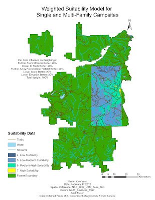
Using a weighted suitability analysis model, areas of high suitability for campers are derived from different weights according to figure 1 below.

Weighted Suitability Model for Single and Multi-Family Campsites
Figure 1 - Weighted Suitability Analysis to Determine Best Location for New Campsite


The above map was created using a weighted suitability analysis. This model was created to run on each of the layers included in the analysis. All layers are reclassified and then calculated using the Weighted Overlay Tool. This tool sets each of the weights (refer to figure above) to be used in a final analysis of the terrain.
Figure 2 - Weighted Suitability Analysis to Derive Camp Site Locations

As well as a weighted suitability analysis, a binary suitability analysis was create. What binary suitability means is that an area can either be regarded as a one, or a zero. The use of boolean logic also applies; areas can be regarded as AND, OR, or XOR.


Figure 3 - Binary Suitability Model
Figure 4 below is the final output for the binary model.

Figure 4 - Binary Suitability Analysis, Areas In  Light Yellow Meet All Critera